Evolution of a book from conception to completion: The Trail of Painted Ponies
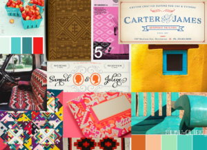
The Trail of Painted Ponies has roots deep in Native American lore. We wanted the interior to be a celebration of the expressive designs and historical legacy The Trail of Painted Ponies created. We searched for color inspiration, design elements such as Native American patterns, and fonts that would help separate our book from the crowd.

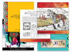
TPP interior rough layout/early cover concept
The initial cover concept went through various stages of design. We wanted the book to invoke the spirit of the Painted Ponies with a large central image while also subtly letting the customer know it’s a coloring book. We experimented with watercolor and color pencil on the cover image.

Feedback/edits
We received our first round of initial feedback and edits from The Trail of Painted Ponies HQ. We arranged the Ponies in the approved order and made edits to the descriptions.

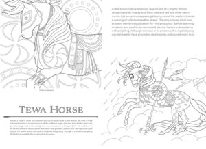
TPP interior refined/cover refined
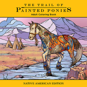
With the additional feedback provided from The Trail of Painted Ponies HQ, we began refining the interior and finalizing the cover design. The cover evolved from the initial concept. We felt that “Carries the Spirit” artwork was a stronger illustration for the cover and decided to remove the watercolor effect. We then decided to use a simple bar of color on the top and bottom of the image to establish a clean look and to place the focus on the Painted Pony illustration. We added Native American inspired patterns on the cover and interior of the book, using bright colors, such as yellow, turquoise and red-orange.

TPP finalized
Once the finalized cover and interior are approved, we send the files off to the printer!
TPP off to print

